Showing posts with label competition. Show all posts

Saturday, March 10, 2012

... and go March-ing on.

The set topic for March is "Seascape/Coastal". One would imagine (well this one certainly did) that the topic would draw comments like "too much sunset, not enough coastal" from the judges.

Well, I went to prints night to find out. Judge was one of the seniors, a member of the team that took the (very good) course I attended last year. The extreme (in my book) was three images (one in each of the grades) all of the same marram seed - the kind of thing that blows though wild-west ghost towns, a tumble-weed. Yea, I guess that it was coastal to the extent that there was sand, and some evidence of water that may have been salty. That left me with the problem of trying hard to find something from the past twelve months or so that would fit the bill.


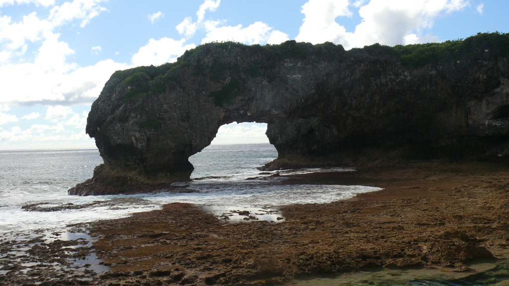
First selection was a b&w version I had put together when it was taken last year. Oh, there are five frames in that stitch. There is a sixth frame that does not quite fit on the left; it is about 10* too far to the left. I reshot that frame after the first pan, and the sky had changed so much that it looks like it had been taken half an hour earlier - or later for that matter.

There is also a series of frames taken in January.


Not really what I was wanting...


This is the best of the bunch so far. It needs a crop, but the right elements are there. Oh, I had stacked up every ND filter I have, total about ND9, and the exposure time was 1.5sec to film. I have learned enough that the Lumix just does not like 1.5 secs. And the horizon is a bit on the tipsy side.


This looks the same, it was the same set-up, but I tried something just a bit different. It is in fact three 0.5sec exposures. Being film one can do these things.

It has interesting possibilities, and next time we go north I will have a film ready for the job. For this competition? No.


The other possibility twists the rules just a bit - like with this one from Taupo. Not that I am overly happy with the frame; it does have its defects.


So, there it is. What to put in for open? No idea at the moment. Perhaps one of the "failures" from the above. I want to keep the "Indecision" frame for later.

One of the set topics for later in the year is "Reflections". It is raining at the moment, and I doubt that we will have a six-month drought through winter. I would like to go back to the Viaduct and play with the lines and colours with some water on them. That might have possibilities. There is also "Night Life" and "Traffic" to consider. Might be able to combine all three...

In the meantime, it will be interesting to see what the projected images judge makes of the entries he has to consider. I am also interested to hear if he has any comment on the latitude adopted by the prints judge. Both are topics that can not be debated on the club site because of the fact that the judge is ctphotography himself.


UPDATE...

Well the decision is made -

The Taupo frame goes to Open, the long "rock" frame goes to Set. Might score a HC for one, both is a long shot...

Went to the Pacific Festival today - very tiring. Best we saw was De La Salle College Niue kapa. VERY energetic...

Friday, February 24, 2012

So the year begins...

Ahhh, time of joys, of the long late summer, and the commencement of the competition scene at club. That latter prospect has improved through the presence of a good mate who has decided to join the club this year (as a “beginner” naturally). The improvement will come from the occasional debate that we may have concerning things photographic.


F’rinstance, a question regarding the nature of “photographic images” was debated over the tea-cups one afternoon this last week. The question arose from Rules 2 and 3 -

2. An entry must originate from a negative, colour slide or digital file that was exposed by the contestant.

3. An entry may be manipulated in any way provided no areas are added that were not exposed by the contestant.

Seems straightforward enough, huh?

I looked long and hard at Rule 2 last year for the “White on white” set competition. I had a white feather – collected from one of my sister’s chooks I think – which I tried scanning with a white background, only problem was that the scan came out somewhat more yellow than I had imagined and the idea was dropped because of my inability to clean the image for consideration. But the question starts at that point – an “image” taken with a scanner? The output is a “digital file”, no?

Consider the use of a digital file taken from a scan of a film image. Is this in any way different to a print taken from a digital file for print competition? That is easy – the answer is “No!”. The premise here is that the image was originally captured using a camera. One can argue the same for an image captured using an iPad camera or phone camera. Equally as valid, equally a “photographic image”.

So, why the objection to an image from a scanner? There is no lens? I believe that the lensing and sensing functions in a scanner would be quite complex. In fact quite as complex as a digital camera in fact. That became a particularly unfruitful moot.

The application of “no areas added that were not exposed” in Rule 3 is comparatively straight-forward. There is a small matter of detection involved. Primary in my mind when I say this is an image that was presented in competition last year under the “photo-journalism” heading. It was of a crowd, either Japanese or Chinese, all looking in the same direction, all dressed in what I would think of as late 50’s or very early 60’s clothes; suits, hats. The overall feeling that I got from it was of immediate post-war Japan. There is no way that I could get any proof, but I had the uneasy feeling that I was looking at an image from the ‘Net rather than the person presenting it, and dating from some 50 years BP rather than being an image from current times.


I am not going to allow the year to get off to a bad start with the prospect of the "Abstract/Concept" as the set topic this month. The judge has been named and to give an indication of what she might expect. Sorry, mine is going to look like this -


I had a long struggle with which to offer as the Set topic. I chose this as the Open entry -


Both images were taken last month at the Auckland Botanical Gardens.

Saturday, November 12, 2011

Nove is coming...

Ye gods!! Almost the end of another year.

I have to consider this month's entries, and what is going up for end of year comps. In one respect one is driving the other.

One of the year-end comps is "Set of Four". Four images from entries to the monthly competitions. At least, that is how I read it. So this is what is going in...


So that sets the Open entry for this month.


The set topic for the month is "Street Culture". To get right to the chase, this was the best of what I got from the library. Taken 2009 in Howick it were...


So there it goes.

There are other comps.

The needles might go in for b&w trophy. Got a chance at least.

Thursday, September 29, 2011

...mber

And so another month drifts quietly to a close. Actually, I have to admit, it turned out to be not half bad in some respects. Primary among the reasons for the good part was the birth of Kath’s twins. That resulted in yt having the house to himself for about 8 days of total self-determination. That status started with the drive back from New Plymouth, which was interrupted along the way by a number of “unscheduled” stops. The remainder of the week was accompanied by watching a bit of rugby. One of the highlights was the U20 and NRL second Minor Finals with Old Dark in one hand and rum in the other. The Sydney league semi was not broadcast or nothing would have got done on Sunday either.


The Awakino Head was probably the highlight of the trip back. There is potential there for some spectacular coast scenery – but very little else truth be told. The beach at Mokau similarly.


Thought about heading up the old timber road from Mokau to Kawhia and Raglan. Dropped the idea when leaving Mokau as the belly was calling for lunch. Tried The Fat Pigeon in Piopio – it was OK but Bosco’s in Te Kuiti is better.


The last Sunday of freedom was mis-spent on re-shooting some of the old attempts at art. I now have a 3m x 1.2m “infinity sheet” in the form of a very nice piece of cotton duck. Next thing to purchase is a 1.2m rod on which to roll it so I do not have to borrow the SWMBO’s flatteninghotter. I used only natural light in the family room.


Which leads into the competition for this month. Judge was another of the senior members – I will stay with my protocol of “No names…”. I had to try and find out just where he was coming from before I started writing this. Interesting cove he is; high-powered member of the club, and in the IT world as well. He is a very respectable photographer as one might imagine.


The pyramid was given “acceptance”, mainly because it did not grab him. He was very up-front; the type of image that it is lies completely outside of his personal taste. Can’t argue with that.

Poor Leo. He was recognised as “large”. The wording fitted the image. The very big defect was that the back of the chair was in focus. Never mind… not all of us have studio soft-boxes that we can trot out at a moment’s notice for that perfect candid shot of a comparatively bad-tempered cat.

The evening ended with a totally unexpected and very unusual experience. I got “chatted up” by a 60-something lady (a member). It was quite un-nerving in some respects. Oh, there was never a hint of anything untoward but the flirting was apparent; even to this old numbskull. Sadly, she is not really my type.


Going back to the pyramid and the mask for a bit, and my re-shoot of the mask.

The image out left is (from top to bottom); test and control for print, f5.6, 1/10; f5.6, 1/20; f5.6, 1/45. This was shot indoors, ambient light only. The three frames are on a single scan, no modification or treatment.

First thing to note is that there is not enough difference between background and object. Simple solution to that is to add light. That will be the next attempt. That will also take out the fold shadows that are all too obvious.

The other thing is the lack of difference between frames 2 and 3. This points up something I have battled for years. If you understand your digital camera you will know that it will - if set on auto - do its utmost to turn everything it sees to an average muddy grey. Commercial printers are no different. They can take a mediocre image and make something out of it. I know. Been there...

Some many years back - over 15 years back - I spent some six months cultivating a (strictly professional) relationship with a lass in the local pharmacy who had been given the job of running the automatic film processing part of the business. We both learned a heck of a lot about how that machine worked.

I know that those three frames (and sadly the rest of the film) can not be rescued.

But ... they can be re-taken.

Tuesday, September 20, 2011

septe

Been a busy month, this. As something of proof, daughter sent us this of the latest additions to her family and the ol' probligo's (now probbly completed)small host of grandchildren.


That took a week or so out of the beginning of the month, if only because the missus was stressed out from the last week of August until the event was over. Then the stress level rose to extreme until packing and travel had been sorted. I got a small number of frames on the way back that might be mildly interesting. I have the coming weekend available for project work before the missus gets back Monday.

So, I have been able to sort adequate entries for club this month -


Set subject this week is "domestic pets". I was tempted by a photo of a rock but decided that tempting judges had gone far enough for the while. Stick to the menu lad.


On the other side, however, I turned this out of the library last week. It is in the same mould as the mask...


I wish I could work out how Frank does his virtual masques and frames.


Oh, the cat? No, he wants it known that he is not fat.

Just big!

All 6.5 kg of him.

Tuesday, August 23, 2011

Not so august?


I have to say that “White on White” is definitely not easy. Attached are before and after of the attempt I put in to club. Confession – the after is “temperature adjusted”, screwed up on the brightness scale by about 60% and converted to black and white, then taken down for the print by 2 stops.


Does it work? We will find out next week.


Went to the final installation of the Grade 2 course the club has been running. Lying around was a print fairly similar to the idea I have been following. Spoke to one of the notables who promptly claimed ownership and said that it had got rubbished at the print night competition the previous night. Oooo-K! Good start that is. I did not press on the point, but if the print was as submitted I can think of two very good reasons why – not the least of which was the cropping as it was marked on the print I was looking at. Given that, my attempt will be lucky to get Acceptance, pushing hard for Merit.


For the open I am beginning to get a bit desperate. At this stage the breaking wave is winning – I might crop that to a 19:6 or thereabouts to take out all but the wave itself. Looking at that on-screen with the blinkers on it might just work for a HC.


The course final night was quite a good evening. In most respects. Out of the ten or so taking part most were a pretty good crew; a police forensic photographer, a retired lady whose husband has very bad Parkinson’s, a lass who is almost blind (and takes a mean photo), a couple others who are better than I am, and the rest. Well, let me limit the rest to just one gentleman. Best illustration of his attitude came toward the evening. There had been a discussion on bulb exposure for fireworks – up to 30 secs. I could not recall if the Lumix had a bulb setting so I tripped through the “snow” to the car and took it inside. No, it does not have a bulb setting; maximum exposure is 8 secs. I was just ruminating this with the person I had been talking to and a voice behind gives a sniff and says “You could not get a decent image with that. Buy a proper camera.”

UPDATE -

The two entries - both Merit. Well, not as bad as some that were rejected as not meeting "White on white" requirements.

The major objection to the vases was "over-exposed". The judge was one of the tutors from the classes and I have to say that he is right. It was not in the camera though as comparison of before (I must find out what caused the white balance to go that way...) and after. There was an intermediate which I rejected because it was too clear; the idea I had was to get the vases to "disappear". Strange.

Image of the night was without doubt presented by another C Grader. Absolute perfection as a product publicity shot; good enough for Vogue even. It will be up on the club site next month.

Tuesday, August 9, 2011

Starting Au-gust..

I am in a quandary.

The set topic for this month is “White on white”. The print competition was last week, and I did not go to club that night. I have this horrendous joke about “monthlies” that would go right over the heads of some senior executives (especially if they have worked for EMA) but which even SWMBO appreciates even if she doesn’t like the tone of the humour one bit. In my case the monthlies strike, without fail, in the last two working days of every month and the following three working days. It is not driven by glands but the need to report to powers-that-be at higher levels of the company by whom I am employed. This need results in emotional and hormonal responses that take out the best part of that week.

As I said, the print competition was last week, and I was not there to see what was going on. I had a brief natter with another member on Tuesday night and was given a rough description of white flowers over white background; kind of thing.

So, why the problem? I know what I want to do. I have had a couple of goes at it and it has not quite worked for me as yet. Yes, it involves white on white; white crockery on white table to be exact. Well, I want the crockery to “disappear”, blend with the tabletop, leaving the tea/coffee, toast and poached egg – with hollandaise if SWMBO wants it. Place the cutlery so that the outlines of the crockery are hinted but not seen… It can work, if I can get sufficient blend between crockery and table without burning the image out by pushing the white too far up and without excessive reflection from the cutlery. So the problems are –

Finding sufficiently white crockery
Removing all shadows and retaining a semblance of depth
Removing the reflections from the cutlery
Interrupting Sunday breakfast long enough to set up the photo.
Not taking so long that SWMBO's egg gets cold

For the open competition? I haven’t really given that any thought. There are a couple of half decent images from Niue I could test the water with. There is a portrait of a senior club member which might go – taken at the last “class” evening when we were playing around with studio and lighting. There are a couple of architecturals which might fit the bill. None of them grab really the goulies.

I have a m-lemma.

Tuesday, July 26, 2011

The rest of July...

A week in the tropics is all that is needed to get the ol’ probligo over the edge of troppo. Came back from Niue absolutely convinced that the Tuesday week was competition night at club. Worry lines crumpled the probligo countenance when the email revealed no evidence of an acknowledgement of his two entries for competition. Come the next Thursday when entries close and still no mail!!!! Panic!!!

What a silly old duffer I am. Wrong week; the competition was last night, a week later than I thought.

Now. How do I put this. Judging started with C Grade Open. A quick flick through the entries first, and the mask is the last of some 10 entries. Tenterhooks!!! The last three before mine earn Honours. Good images, too. The mask flicks on-screen; and the judge says “Only one word – Honours.” I must retake that image, if only to prove to myself that I can do it again; that it was not a fluke. Besides I need to set myself up with an infinity sheet – a good one - as well.

Then on to Set Subject. Same process, except that mine is about 5th of 8 or so entries. “Good to see someone thinking outside the square.” The difference between Highly commended and Honours? The little one on the end “looking” to the side. Thanks SWMBO, good idea and worth the effort.

End of the night comes and those present are starting to get restless after an exposition from worthy judge on flash; interesting ideas but how do I get a Sony system flash?? Thought required – mainly how to rob banks. Hang on, we forgot to nominate the night winners. C Grade image of the month – the probligo’s mask.

So, there y’go. In the club for six months and a winner already… Hard act to follow, that one.

Niue was a joy. Innumerable challenges. From caves including stalagmites and stalactites to hard tropic midday, deep shadow to early morning and late evening colours, HDR to soft monotones.


Wednesday, July 6, 2011

July will be a short month...

... because the ol probligo and Mrs probligo are heading north for a week. Being empty-nesters does have the advantage of providing a little extra from time to time - usually ever second year or so - so that we can at least give the pretence of a higher level of social standing than we actually enjoy. So for that reason, we are heading this year to the general vicinity of the equator to a place known localy as "The Rock" and in other places as Niue.

This being the case, and having had the good fortune to have listened (for once) to the opines of Mrs probligo, I have already sorted the entries for this month's projected image competition at the club.


The set topic for this month is "Eyes" and I credit the missus for this idea. Taken with +4 and +2 diopters, RAW file against a black card background. Post camera processing was limited to knocking the black up by three notches to remove the texture of the card, knocking the highlights back by a similar amount, and converting to b&w to remove the (quite bad) chromatic abberation.

While setting it up it reminded me a little of the old school photo and hence the small one on the end with his attention diverted elsewhere...


I will let the reader sort this one. It is scanned from a photo I took about two years back; one of a series that I intend taking up again.

Post scan processing is limited to masking out the horizon line because I was not using an infinity sheet. It was going to be my entry in Set but it is heading for Open instead.

Tuesday, June 28, 2011

The rest of June -

There are only a few days left in the month, and next month will be fairly busy so I will wrap June up here and now.

There was club last night, with the competition for projected images; set subject for the month was “contre jour”. For those who know, please ignore the next para while I try to explain exactly what that means…

“Contre jour” means “against the light”. A good c-j image will combine three essential elements –

Strong back light.
Visibility of detail in the subject (not a silhouette).
A measure of halo around part, or all, of the subject.

Judge for the night was a (high-standing and well qualified) club member. I give her credit for being fairly gentle with those who submitted entries in C Grade and missed the boat. The B Grade entries had made a quite better effort, I think that only two out of the eight entries were “accepted” due to not meeting the requirements of c-j images. When it came to the A Grade entries, she did not quite have the gumption to follow through on an initial comment that a person at this level should be able to correctly meet the requirements of a c-j image. To award “acceptance” to a disqualified image at the top level is almost dishonest. To make matters worse, it was not a single entry that failed the compliance test but almost half of those eight or so images presented.

The real disappointment about last night’s competition came in the Open section and centres on two, perhaps three images.

There is a fashion in these recent times for a whole raft of image types – yes I have been here before – that in the past might have been classified as “out of focus” through to “very bad camera shake – should use a tripod” to be lauded as “Impressionist” images. The other euphemism, one which is somewhat more tightly defined now, is “Minimalist”. I gave a brief report on a local exhibition, an ex-member of the club, that we went to take a look at earlier in the month. The standard of his– as “Impressionist” – images was several blocks ahead of the efforts at last night’s meeting. Given what was presented last night I could actually consider his as praiseworthy.

“Impressionist” as a descriptive term has a very well defined meaning in the world of fine art. It is a classification that centres on the work of a comparatively small number of people over a similarly short period of time in the mid to late 19th and very early 20th centuries. Names such as van Gogh, Renoir, Monet, Manet spring immediately to mind. I read some while back, a book or article concerning the sight problems that some or all of these artists suffered. Van Gogh for example suffered from glaucoma. The internal pressure that distorts the eyeball creates focus problems and this has been used to explain the “Starry starry night” as just one example. He also took digitalis as a control for the epilepsy he suffered. Looking at Wiki it seems that digitalis causes a persistent yellow coloration to the sight. The original article (from far-off recollection) listed about six of the Impressionists) all of whom had a problem with vision – possibly including such rarities as synaesthesia. Just how accurate these interpretations (and my recollection) are, is of small importance.

I give credit to those who tried to create "Impressionist" images, and their efforts were rewarded with “Merit” and one “Highly Commended”. One image which did deserve the tag of “Impressionist” had as its subject the reflection of two people having a conversation. The reflection was on the side of a brewing vat with consequent distortion of the scene; the whole image being very well managed indeed. It was not until the image was explained that the full impact of the technical side became apparent. It surely deserved the accolade of “Honours”.

I can but wonder what might be thought by a competition judge of an image, badly out of focus or using an astigmatic lens with a yellow filter. Perhaps that is worth a try – title “After van Gogh”.

The more formal part of the evening over, one of the senior members gave an exposition on the topic of depth of field and focus. Those with mathematical bent might find some interest here if google is prepared to play ball. I have looked through that and the eyes glazed over after the first para or so. As did the majority of those present last night at club. No question that the presenter knew exactly what he was talking about, and trying to explain. His explanation was simple enough but would have left many floundering in the shallows. One thing that I did work out - why a pinhole camera has infinite (or very near) depth of field. It has to do with the length of the lens, its focal length and possibly one or two other things. A pinhole has close to zero length - decimals of a millimetre in a good one. That seems to be (from what I could make out last night) why a pinhole is so... Oh, and I might try and get a copy of that "Focus Encyclopedia".

Monday, May 9, 2011

The April that was...

In some ways this photographing lark is a bit strange. I say that on very limited recent experience, but it is a feeling that matches with the two years I was previously involved (and competing) at club.


This last fortnight included the slides/projected images competition on Easter Monday. I had in two entries; the “privacy” one with the bowlers, and the other the Wairere Boulders picture of the interior of a “partial cave” above. Because it was Easter Monday, I was not there to hear the judge’s comments. Suffice to say that both earned H/C’s, a little to my surprise for the bowlers privacy. But, I can imagine the difficulty the judge may have had with the other.

Regulars (if they do exist) will know my rabbiting on about “minimalist” images. I set this one up as an instance of other approaches to the “minimum colour, minimum contrast” images that seem to rank in this strange offshoot of the craft.

There is another aspect to this; it comes (in my mind at least) under the heading of “realism”. It is a strange thing. One could not imagine that there could be anything more “real” than a photograph image. OK, there is also a boundary here. It lies between the “real, in the camera, in the eye” image and what can be achieved with varying degrees of processing.

The first, annoying, brush was the criticism of the waxeye image because of the “boring, dull grey” background. Yes, because that is what it was like; trying hard to rain and not quite succeeding.

The second - again I think I have mentioned this - is the “dramatic sky, shadow, dramatic landscape” legacy of the likes of Ansell Adams and his followers. Now do not get me wrong. Adams is the pinnacle of landscape photography in most quarters; he is in mine. He deserves the adulation and sincere imitation of any who take their imagery seriously.

Can you hear the “BUT” yet?

Adams’s great skill was in his ability to capture – in black and white – the colour and drama of what he was seeing. There is an additional talent of “right place, right time”. He had a great talent in the production of his images.

Right now, off on a different tack…

The probligo’s better half is a member of the local tennis club, and they have an annual Charity Day in support of the local hospice. It is very successful, and generously supported. She suggested that I contribute a print of my two “oyster catchers”. While this is by no means anywhere near competing with Adams or even some of the beginners at the camera club, it is a “good” image – I like it. SWMBO over-heard comment while it was on the table for sale, “… the sky is never that colour… too artificial…”. Sorry luvvies, it is that colour if you look; particularly through a polariser; or if you look rather than just “see”. The lovely deep cobalt blue that comes on a clear winter day when the sky has his face well scrubbed and all.

The advent of digital imaging, and the facility of processing those images, has widened the whole idea of photographic image into an art that rivals the fine arts of the past in both scope and variety. So one can project into modern photography the parallels of all the offshoots ranging from the (intentionally) surreal distortion of reality, to the quick sketch, to the monographic record, to personal impression and interpretation. A quiet couple of hours on the net will find photographic surrealism that would rival that of Ernst, Miro and Dali; impressionist use of form and colour to rival Manet, Monet and Pissaro; perhaps even the simple lines of primitivism and "child art".

I have at long last received my copy of the "approved text" for the club's course on landscape photography. One of the most stunning images in this book would likely qualify under the heading of "field colour abstract. There are essentially five blocks of colour with very little in the way of detail; blue sky, two foreground wedges of colour, and between them is a small black silhouette of forest.

And I think that is where the "BUT" arrives...

Friday, April 15, 2011

April already...

Quite an interesting month thus far.

Went to the first of the club "workshops" Tuesday week ago. A lot of faffing about, but one or two interesting bits. The four taking the course spent about the first 90 minutes introducing themselves. There was no opportunity given for the participants to introduce themselves - a pity that because I might now have the names but putting faces to them? Impossible.

Got "homework, due Thursday this week, and I flubbed about and got half of it in. There were ten frames required that I did not submit - two landscape subjects with POI shown in each of the four "thirds" corners, "golden square" corner and central. Could not find a bloody thing to fit the requirement. Submitted eight other frames that (I hope) meet the requirements of the remaining exercises... using different focal lengths etc. Examples shown...
...using different focal lengths...


... frame which works better as landscape rather than portrait presentation.


Set topic for the month is "Privacy". Could not make up my mind about either of the two below. The bowlers won for set topic and the dandelion is in for open.
The bowlers was taken at Clevedon last year. The Mrs probligo enjoys walking and decided to enter one of the SUB (Sarah Ulmer something; and look SU up in the cycling press from about 6 years back) 10km walks. Did very well, first in the 65-70 group. Ol' probligo hung around for photo ops and noticed the old codgers playing bowls next door. The catch took a bit of patience - three ends to be precise - before chance and a fair bit of sidling got everything in the right places. There is one clue which shows that it was cropped. See if you can pick it :).


The dandelion was taken on a Sunday drive not long after. Again out Clevedon way. There is a disused silo in the middle of a paddock which had some interesting colour and texture. I was walking back to the car and the dandelion caught my eye... Two frames later and the cat got up and walked away in disgust.


On the matter of "there ain't nothin new"...

Went to the library this am. Picked up a copy of a Brit photography magazine with an article about 1 minute plus exposure landscapes. Uses a ND10 filter. What was I saying? Still, there is unending possibility. Most of the ideas revolve around the "minimalist" ideas of moving water and old jetties. The ol' probligo has a few of his own. Experimentation at Easter in Opo.

Oh, May sees the first of the club special comps. I am going to put the foggy estuary in for digital image, and this one for the Maslen Cup (black and white landscape). Evil grin...

Saturday, March 19, 2011

March so far...

Well, the month is half gone.


I went to club for the first meeting of this month. There was another couple of new members :D This is getting to be quite uproarious. But as I said in the previous post the test will be when my next set of entries goes in. I am tossing up between the Tank photo I submitted last month and another which I might put into a later category.


If I use the Tank photo, I need to dodge the background somewhat. I NOW HAVE PS ELEMENTS 9 so it should be a breeze, right?


Yeah. Right! That battle will continue. The original is in fact on film, printed to cd, so I am not sure of the quality at that level.


I spent this weekend digging through the old files. There were a number of quite important frames I have been missing. In the course of that search I found at least three of the lost ones plus a "perfect" image for the Sports next week. I have also dug out a frame for Open so here goes ...

Tuesday, March 1, 2011

February - 2010

I went along to the camera club of choice on the second Monday of Feb and signed myself up. Good-oh, I thought. No dramas there! Happy faces but apart from an announcement at the opening of the more formal part and one or two sidelong glances from some oldies there was very little reaction. Well to be frank I was not expecting to be welcomed as the prodigal son.

That night was on print mounting, a topic that was one of the difficulties I had originally. I was hoping to catch up on what was acceptable, the current techniques. What I found was that I need to invest some $250 in a matt cutter. An extremely interesting tool ranking alongside of a balsa stripper for builders of small aircraft models. Perhaps next year...[GRIN]

In the meantime, there is much to be learned from the experts. I have to get the discipline back in gear.


The third Monday of each month is “projected images night”. So, I selected a couple appropriate to the occasion (I have stuck them in below). I have to say they are not my best. The Yasur image is “clouded” by the ash being emitted continuously from the crater. That makes the hot lines from the ejected rock look as though they are out of focus. BTW that was a 40 second exposure taken about 20:00. (What a weak excuse, the old Minolta was on its last legs as well).


“Tank” (and that is his nickname) is a delightful chappie, from the north of the Hokianga. He has been competing at the Opo Chops for more years than he cares to remember. As you can see from the expression on his face, he enjoys it even if he can’t keep up with his handicap. I like the image because of the smile on his face, and the action even if the motion blurs and all are absent… I was very tempted to enter it in the Set topic of “Hot” but the volcano “won”.

How would it have done in the club comp? Acceptance probably. It certainly would not have ranked with some of the others shown. So I have to be a bit realistic about things; most of all the ability I have which I know is small compared with many others.

Now notice the doubt there? My entries did not turn up in the competition. Nor did my badge either. I have not yet been approved as a member. Well, fair enough I thought. I wasn’t too worried because of the standard (or lack thereof) of my entries anyway. I wonder if anyone will look back through the club records for about 5 years back. I know my name is on at least one trophy; but that was then…

Last night the club newsletter for March arrives by virtual mail. Greetings to one new and one returning member. OK! My name in lights!! Not. I must have joined on the wrong night. [ANOTHER GRIN].

March should be interesting when I send in my entries. I am going to tag them with a reply requirement for receipt and open. Ah, the fun… :D

Belated Update -

I realised that I had missed the heading, so that has been corrected.

We (Mrs probligo and yt) went to the Lantern Festival. Interesting. And some very crappy images. I might get brave enough to select one or two of the better ones...

Sunday, November 28, 2010

The month of November - that was...

I don't know where it went, but then that is a different story.

After tarting myself down to Manukau Photographic Soc. I went back to the old haunt at Howick Camera Club. Not a lot has changed there. The club seems to be quite a bit bigger, with a goodly number there on the night. They also have "C", "Intermediate" and "Elite" categories for membership. NEAT!! They even have a "m-a-g" person who passed on the fact that I was an ex- returning to the fold as it were. No on rushed over to shake my hand or even acknowledge me so to that extent, nothing much has changed.

I think I might concentrate on set subject again, if only because I enjoy the challenge. I have the list for next year and most are pretty standard. "Hot", "Sport" come to mind in that category of "standard".

There are two which I think will be a real challenge.

"White on white". Got an idea for this; involves a plate, a white infinity sheet, and multiple exposure. Thoughts processing furiously on how to achieve the kind of light/shadow I want...

"Eyes". Given I am not good at people photos, this is a real challenge. It strikes me as "real, in your face" photography.

One to have fun with - "Privacy". Potential for political comment here is endless. I might visit Q St one afternoon and line up unsuspecting peds and ask them to hide their faces from me. Hopefully I will also have some police in the same frame... Hmmm and evil grin on that one.