Tuesday, August 23, 2011

Not so august?


I have to say that “White on White” is definitely not easy. Attached are before and after of the attempt I put in to club. Confession – the after is “temperature adjusted”, screwed up on the brightness scale by about 60% and converted to black and white, then taken down for the print by 2 stops.


Does it work? We will find out next week.


Went to the final installation of the Grade 2 course the club has been running. Lying around was a print fairly similar to the idea I have been following. Spoke to one of the notables who promptly claimed ownership and said that it had got rubbished at the print night competition the previous night. Oooo-K! Good start that is. I did not press on the point, but if the print was as submitted I can think of two very good reasons why – not the least of which was the cropping as it was marked on the print I was looking at. Given that, my attempt will be lucky to get Acceptance, pushing hard for Merit.


For the open I am beginning to get a bit desperate. At this stage the breaking wave is winning – I might crop that to a 19:6 or thereabouts to take out all but the wave itself. Looking at that on-screen with the blinkers on it might just work for a HC.


The course final night was quite a good evening. In most respects. Out of the ten or so taking part most were a pretty good crew; a police forensic photographer, a retired lady whose husband has very bad Parkinson’s, a lass who is almost blind (and takes a mean photo), a couple others who are better than I am, and the rest. Well, let me limit the rest to just one gentleman. Best illustration of his attitude came toward the evening. There had been a discussion on bulb exposure for fireworks – up to 30 secs. I could not recall if the Lumix had a bulb setting so I tripped through the “snow” to the car and took it inside. No, it does not have a bulb setting; maximum exposure is 8 secs. I was just ruminating this with the person I had been talking to and a voice behind gives a sniff and says “You could not get a decent image with that. Buy a proper camera.”

UPDATE -

The two entries - both Merit. Well, not as bad as some that were rejected as not meeting "White on white" requirements.

The major objection to the vases was "over-exposed". The judge was one of the tutors from the classes and I have to say that he is right. It was not in the camera though as comparison of before (I must find out what caused the white balance to go that way...) and after. There was an intermediate which I rejected because it was too clear; the idea I had was to get the vases to "disappear". Strange.

Image of the night was without doubt presented by another C Grader. Absolute perfection as a product publicity shot; good enough for Vogue even. It will be up on the club site next month.

Tuesday, August 9, 2011

Starting Au-gust..

I am in a quandary.

The set topic for this month is “White on white”. The print competition was last week, and I did not go to club that night. I have this horrendous joke about “monthlies” that would go right over the heads of some senior executives (especially if they have worked for EMA) but which even SWMBO appreciates even if she doesn’t like the tone of the humour one bit. In my case the monthlies strike, without fail, in the last two working days of every month and the following three working days. It is not driven by glands but the need to report to powers-that-be at higher levels of the company by whom I am employed. This need results in emotional and hormonal responses that take out the best part of that week.

As I said, the print competition was last week, and I was not there to see what was going on. I had a brief natter with another member on Tuesday night and was given a rough description of white flowers over white background; kind of thing.

So, why the problem? I know what I want to do. I have had a couple of goes at it and it has not quite worked for me as yet. Yes, it involves white on white; white crockery on white table to be exact. Well, I want the crockery to “disappear”, blend with the tabletop, leaving the tea/coffee, toast and poached egg – with hollandaise if SWMBO wants it. Place the cutlery so that the outlines of the crockery are hinted but not seen… It can work, if I can get sufficient blend between crockery and table without burning the image out by pushing the white too far up and without excessive reflection from the cutlery. So the problems are –

Finding sufficiently white crockery
Removing all shadows and retaining a semblance of depth
Removing the reflections from the cutlery
Interrupting Sunday breakfast long enough to set up the photo.
Not taking so long that SWMBO's egg gets cold

For the open competition? I haven’t really given that any thought. There are a couple of half decent images from Niue I could test the water with. There is a portrait of a senior club member which might go – taken at the last “class” evening when we were playing around with studio and lighting. There are a couple of architecturals which might fit the bill. None of them grab really the goulies.

I have a m-lemma.

Tuesday, July 26, 2011

The rest of July...

A week in the tropics is all that is needed to get the ol’ probligo over the edge of troppo. Came back from Niue absolutely convinced that the Tuesday week was competition night at club. Worry lines crumpled the probligo countenance when the email revealed no evidence of an acknowledgement of his two entries for competition. Come the next Thursday when entries close and still no mail!!!! Panic!!!

What a silly old duffer I am. Wrong week; the competition was last night, a week later than I thought.

Now. How do I put this. Judging started with C Grade Open. A quick flick through the entries first, and the mask is the last of some 10 entries. Tenterhooks!!! The last three before mine earn Honours. Good images, too. The mask flicks on-screen; and the judge says “Only one word – Honours.” I must retake that image, if only to prove to myself that I can do it again; that it was not a fluke. Besides I need to set myself up with an infinity sheet – a good one - as well.

Then on to Set Subject. Same process, except that mine is about 5th of 8 or so entries. “Good to see someone thinking outside the square.” The difference between Highly commended and Honours? The little one on the end “looking” to the side. Thanks SWMBO, good idea and worth the effort.

End of the night comes and those present are starting to get restless after an exposition from worthy judge on flash; interesting ideas but how do I get a Sony system flash?? Thought required – mainly how to rob banks. Hang on, we forgot to nominate the night winners. C Grade image of the month – the probligo’s mask.

So, there y’go. In the club for six months and a winner already… Hard act to follow, that one.

Niue was a joy. Innumerable challenges. From caves including stalagmites and stalactites to hard tropic midday, deep shadow to early morning and late evening colours, HDR to soft monotones.


Wednesday, July 6, 2011

July will be a short month...

... because the ol probligo and Mrs probligo are heading north for a week. Being empty-nesters does have the advantage of providing a little extra from time to time - usually ever second year or so - so that we can at least give the pretence of a higher level of social standing than we actually enjoy. So for that reason, we are heading this year to the general vicinity of the equator to a place known localy as "The Rock" and in other places as Niue.

This being the case, and having had the good fortune to have listened (for once) to the opines of Mrs probligo, I have already sorted the entries for this month's projected image competition at the club.


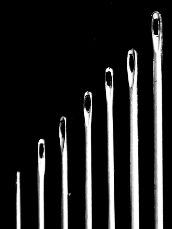
The set topic for this month is "Eyes" and I credit the missus for this idea. Taken with +4 and +2 diopters, RAW file against a black card background. Post camera processing was limited to knocking the black up by three notches to remove the texture of the card, knocking the highlights back by a similar amount, and converting to b&w to remove the (quite bad) chromatic abberation.

While setting it up it reminded me a little of the old school photo and hence the small one on the end with his attention diverted elsewhere...


I will let the reader sort this one. It is scanned from a photo I took about two years back; one of a series that I intend taking up again.

Post scan processing is limited to masking out the horizon line because I was not using an infinity sheet. It was going to be my entry in Set but it is heading for Open instead.

Tuesday, June 28, 2011

The rest of June -

There are only a few days left in the month, and next month will be fairly busy so I will wrap June up here and now.

There was club last night, with the competition for projected images; set subject for the month was “contre jour”. For those who know, please ignore the next para while I try to explain exactly what that means…

“Contre jour” means “against the light”. A good c-j image will combine three essential elements –

Strong back light.
Visibility of detail in the subject (not a silhouette).
A measure of halo around part, or all, of the subject.

Judge for the night was a (high-standing and well qualified) club member. I give her credit for being fairly gentle with those who submitted entries in C Grade and missed the boat. The B Grade entries had made a quite better effort, I think that only two out of the eight entries were “accepted” due to not meeting the requirements of c-j images. When it came to the A Grade entries, she did not quite have the gumption to follow through on an initial comment that a person at this level should be able to correctly meet the requirements of a c-j image. To award “acceptance” to a disqualified image at the top level is almost dishonest. To make matters worse, it was not a single entry that failed the compliance test but almost half of those eight or so images presented.

The real disappointment about last night’s competition came in the Open section and centres on two, perhaps three images.

There is a fashion in these recent times for a whole raft of image types – yes I have been here before – that in the past might have been classified as “out of focus” through to “very bad camera shake – should use a tripod” to be lauded as “Impressionist” images. The other euphemism, one which is somewhat more tightly defined now, is “Minimalist”. I gave a brief report on a local exhibition, an ex-member of the club, that we went to take a look at earlier in the month. The standard of his– as “Impressionist” – images was several blocks ahead of the efforts at last night’s meeting. Given what was presented last night I could actually consider his as praiseworthy.

“Impressionist” as a descriptive term has a very well defined meaning in the world of fine art. It is a classification that centres on the work of a comparatively small number of people over a similarly short period of time in the mid to late 19th and very early 20th centuries. Names such as van Gogh, Renoir, Monet, Manet spring immediately to mind. I read some while back, a book or article concerning the sight problems that some or all of these artists suffered. Van Gogh for example suffered from glaucoma. The internal pressure that distorts the eyeball creates focus problems and this has been used to explain the “Starry starry night” as just one example. He also took digitalis as a control for the epilepsy he suffered. Looking at Wiki it seems that digitalis causes a persistent yellow coloration to the sight. The original article (from far-off recollection) listed about six of the Impressionists) all of whom had a problem with vision – possibly including such rarities as synaesthesia. Just how accurate these interpretations (and my recollection) are, is of small importance.

I give credit to those who tried to create "Impressionist" images, and their efforts were rewarded with “Merit” and one “Highly Commended”. One image which did deserve the tag of “Impressionist” had as its subject the reflection of two people having a conversation. The reflection was on the side of a brewing vat with consequent distortion of the scene; the whole image being very well managed indeed. It was not until the image was explained that the full impact of the technical side became apparent. It surely deserved the accolade of “Honours”.

I can but wonder what might be thought by a competition judge of an image, badly out of focus or using an astigmatic lens with a yellow filter. Perhaps that is worth a try – title “After van Gogh”.

The more formal part of the evening over, one of the senior members gave an exposition on the topic of depth of field and focus. Those with mathematical bent might find some interest here if google is prepared to play ball. I have looked through that and the eyes glazed over after the first para or so. As did the majority of those present last night at club. No question that the presenter knew exactly what he was talking about, and trying to explain. His explanation was simple enough but would have left many floundering in the shallows. One thing that I did work out - why a pinhole camera has infinite (or very near) depth of field. It has to do with the length of the lens, its focal length and possibly one or two other things. A pinhole has close to zero length - decimals of a millimetre in a good one. That seems to be (from what I could make out last night) why a pinhole is so... Oh, and I might try and get a copy of that "Focus Encyclopedia".

Tuesday, June 21, 2011

For the solstice...

I came across a book in the library last month, somewhat by chance, that is proving to be of more than passing interest. It is biographical, not in the usual sense but as a collection of papers, essays and letters. An instance that caught the eye and the mind at once -


Photography as a fad is well-nigh on its last legs, thanks principally to the bicycle craze. Those seriously interested in its advancement do not look upon this state of affairs as a misfortune, but as a disguised blessing, inasmuch as photography had been classed as a sport by nearly all of hose who deserted its ranks and fled to the present idol, the bicycle. The only persons who seem to look upon this turn of affairs as entirely unwelcome are those engaged in manufacturing and selling photographic goods. It was, undoubtedly, due to the hand camera that photography became so generally popular a few years ago. Every Tom, Dick and Harry could, without trouble, learn how to get something or other on a sensitive plate, and this is what the public wanted - no work and lots of fun. Thanks to the efforts of these persons hand camera and bad work became synonymous. The climax was reached when an enterprising firm flooded the market with a very ingenious hand camera and the announcement "You press the button, and we do the rest." This was the beginning of the "photographing by the yard" era and the ranks of enthusiastic Button Pressers were enlarged to enormous dimensions. The hand camera ruled supreme.


Before you run into the distance, think "digital camera" in the place of "hand camera" and you would have heard some ten or fifteen years back the exact same sentiments echoing through the august halls of probably every camera club in the land.


In 1890 when I returned to America I found that photography as I understood it hardly existed; that an instrument had been put on the market shortly before called the "Kodak" and that the slogan sent out to advertisers read, "You press the button and we do the rest." The idea sickened me.
...
Finally one day I met a middle-aged stock broker by the name of W.B. Post who had just returned from Nassau. He showed me some four-by-five prints he had made. I was amazed. They were beautiful.
...
He asked me if I did not want to try out his camera. The temptation was too great to resist. I had certain things in mind that I knew could not be done with the large camera and tripod.

So in 1892, in February, there was a great blizzaed. I loved snow, I loved rain. I loved the deserted streets. All these seemed to attune to my own feeling.

During the blizzard I stood at the corner of Thirty-fifth Street and Fifth Avenue with Post's camera. I had watched the lumbering stage-coaches appearing through the snow; the horses, the drivers, the driving snow - the whole feeling - and I wondered could what I felt be photographed.


The resulting image you will probably find on the net if you search "Winter - Fifth Avenue" and "Stieglitz". And those dates are not typos. This was in the 1890's and Stieglitz was one of a number primarily involved in the establishment of photography as a practical technology and as one of the arts.

The emotional strength of Stieglitz's campaign is illustrated best by a letter written in 1942 - a few years before his death - following a request that he contribute to an exhibition to be toured to Army corps on active duty. The request stated that there could be no guarantee that prints sent would be returned, and that mounts were to be standardised. Stieglitz's reaction -

I have your communication of January 12th. What am I to say? In a sense I am horrified.

First of all, I am not qualified, according to your letter, to contribute a print, as I have not as yet become a professional photographer. But even if I ignored this, what I might look upon as a "slip", I could not possibly send you a print of mine as I have spent my life in fighting for the recognition of photography as an additional medium of expression ranking with the other media of expression such as painting, etching, lithography, drawing, etc., etc.

You seem to assume that a photograph is one of a dozen or a hundred or maybe a million prints, all prints from one negative necessarily being alike and so replaceable. But then along comes one print that embodies something that you have to say that is subtle and elusive, something that is still a straight print, but when shown with a thousand mechanically made prints, has something that the others don't have. What is it that this print has? It is certainly something not based on a trick. It is something born of spirit, and spirit is intangible while the mechanical is tangible. If a print that I might send did not have this intangible, what would be the value of sending it out?... I might just as well say that any machine can take a picture, and turn out a print mechanically. You might get a wonderful picture as a result, but they would not contain that something called love or passion, both of which are required to bring forth a living print - or any other living creative expression. A print lacking these elements is simply an illustration.


Stieglitz should be recognised as one of the unsung heroes of the photographic world. Not for his skill as a photographer - in his time he was a leading technician as well as artist. Not for his unending fight to have photography added to the visual arts - a battle that has finally waned in the past generation or two.

He deserves recognition as an artist of light, an artist of the ordinary in extra-ordinary light, his ability to record emotion in two dimensions.

And I shall return to my practice of making illustrations...

Friday, May 27, 2011

More of May...

Being Saturday, the probligo and SWMBO went to the library, shopping (fresh greens etc for the weekend and a bottle of wine) followed by lunch out (that is not ordinaire!) and a visit to Uxbridge. A word of explanation on the latter. Uxbridge is the local arts centre, based on one of the old church halls. Presbyterian, I think. Occasionally they have some really worthwhile things going and this was the reason for today's visit.

An ex-member of Howick Camera Club, one Derek Penlington, had a display of some of his more recent work. He has been working in long-exposure landscapes; movement of the camera; multiple exposure. Interesting but, I have to say, a rather limited range. There were perhaps four sequences of (similar) images; a seagull in long and multiple exposures; wave-break (surf); kaihikatea swamp; an autumn scene. Good images, nothing particularly amazing. I thought that there would be far greater impact if he had taken the same image in bright light, with bright colours, and used ND filters to lengthen the exposure. There - something to try.

Like this as an example -

Not as extreme as Penlington - nowhere near. But the idea of a passing autumn breeze is (I think) very well conveyed at 1/15 as against 1/250.